
Communications
Support Units
Training & Conferencing
Applications

Anatomy of a Successful Post
A Social Media Content Analysis
- reached 57,225 people
- 1,826 engagements
- 926 total likes
- 195 comments
- 568 shares
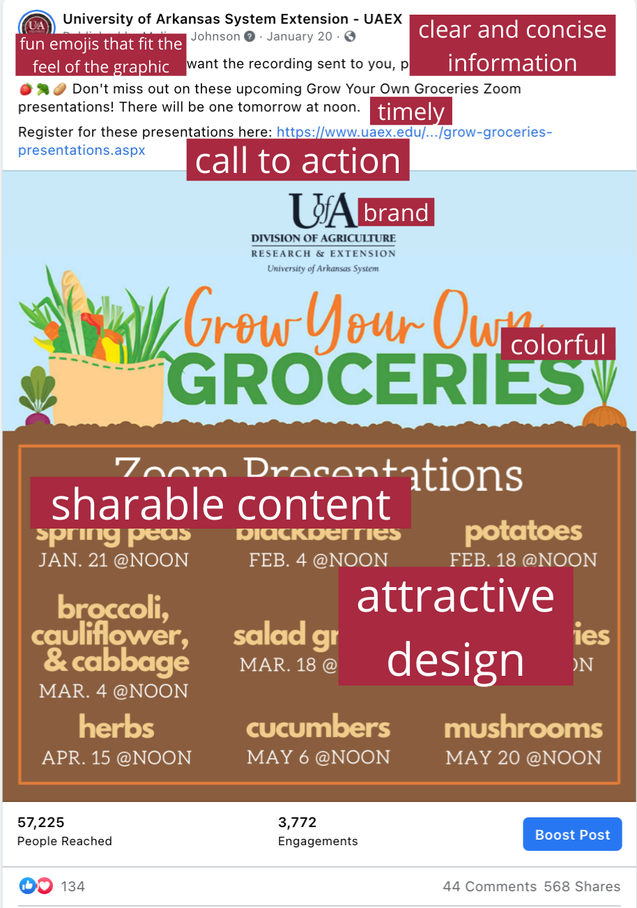
The text is simple, clear, and concise
No extra fluff. Just a simple "Don't miss this!!" The graphic only contains the minimum amount of info readers need to understand what is going on.
The mood of the text matches the graphic
The graphic is fun, and the emojis in the text are fun, too! It's all around a fun post. Fun posts are fantastic for engaging followers.
The post was timely
The first Grow Your Own Groceries event was "tomorrow." This created a sense of urgency to pay attention to this post.
There is a call to action
"Register at this link!" The call to action does a couple things. First, it gives viewers a task to complete. Second, having a link to click on a.) drives traffic to our website, and b.) increases the numbers in our social media reports. We gave our viewers something to click on, and they clicked 628 times.
Branding
Don't forget to put our brand on your content. Branding helps people remember and come back to you for information in the future.
Color
Never ever ever underestimate the power of color! We could talk for days about how important color is in your content. The colors chosen here were a great choice. Let's look at why.
The theme is gardening
What do we think of when we think of gardening? Dirt, carrots, leaves and grass, a cloudless blue sky. The colors chosen here (orange, brown, green, blue) tell a story.
Contrast
The light blue and the bright orange contrast each other. This tells the human eye, "Hey!! Look at me!"
This is highly shareable content
If you are looking to increase your numbers, you want your followers to SHARE, SHARE, SHARE! If the content you make is something people want to share (i.e., content people can relate to, that excites them, engages them, or makes them think, "I know people who will want to see this!"), you will see a boost in your numbers.
Attractive design
The Grow Your Own Groceries logo is very cute, and we played off the logo when designing this graphic by making it seem as though the words were buried underground. The fonts match and work with each other, not against each other. The colors compliment each other (brown, green, orange, and beige). When choosing colors, ask yourself, does this look right? Don't try to force colors to work together. If it doesn't work, it just doesn't work. The multiple fonts and colors help the viewer distinguish the different types of information.
Accessibility
While the graphic full of text isn't necessarily accessible for users who use screen-readers, we described the graphic in the alt text. Not only does this help users who work with technology such as screen-readers, but it also helps search engines find the post as well.
