How do I make my Instagram posts accessible?
With Instagram being an incredibly visual space, it is important that you keep your visually impaired users in mind when creating, posting, and facilitating content. Keeping accessibility practices in mind will help you reach a wider audience and improve interactions with your users.
1. Limit the amount of text that is in your images.
Text that is on the image in a post (sometimes called "flattened text") is inaccessible to screen reader users. Because of this, any text in an image must be repeated in either the alternative text of the time, or the post caption.
2. Don't use decorate fonts in your post.
Though decorative text can look interesting to sighted users, it can't be understood by screen readers. Decorative text should be avoided so everyone can understand your message.
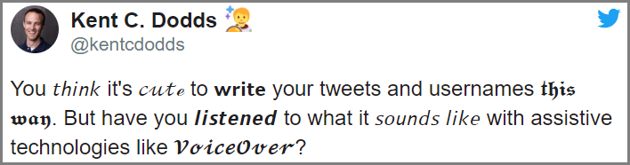
The text in this tweet is written with decorative fonts and are, unfortunately, unreadable by screen readers.
3. Add alt-text to your post.
It is vitally important to add alternative text to your images - especially on Instagram. With this website being so visually posted, it can be an added challenge for screen reader users to interact meaningfully with the content if you don't add alt-text.
Learn more about using alt-text here.
4. Limit your emoji's.
Emoji's are great for expressing meaning - but can be overwhelming for screen reader users when used extensively. Try to limit the amount of emoji's you use for posts, and don't clutter them repeatedly.
What do emoji's sounds like on a screen reader?
5. Add captions to your Instagram Reels.
Have you ever tried watching a video in a lowed room, or someplace you have to be quiet? Adding captions to your Instagram videos helps both people with disabilities and people without disabilities understand and interact with your content.
6. Check your color contrast.
Having good color contrast is very important for making sure low vision and color blind users can still see an image in context. Make sure to double check that any images associated with your tweets meet color contrast guidelines.
Learn more about color contrast.
7. Use CamelCase hashtags.
When using hashtags, it is considered best practice to write them in a CamelCase style. CamelCase is the practice of making the first letter of each word in a hashtag have an uppercase letter. This allows screen readers to understand how words are separated in a hashtag, while also making it easier for sighted users to read as well.
#thisisntaccessible, but #ThisIsAccessible
What do hashtags sound like using a screen reader?
Additional Resources
How to make your Instagram account more accessible - The Big Hack
Accessibility on Instagram: The Complete Guide 2022
Accessibility - Instagram Help Center
Still Need Help?
Let us know! We are happy to help you make your content, documents, and webpages more accessible.
Please contact accessibility@uada.edu